Summary:
Current UI was dated and users could not complete simple tasks without having to go through several windows making the UI too cumbersome. I proposed a UI overhaul that simplified tasks while updating the interface to a more modern design. Pictures below ⤵
The Problem..
Telepresence is an augmented reality application created for front-line workers to solve day-to-day problems with a remote expert. Using AR technologies to increase virtual communication, Telepresence enables users to highlight key objects around them spatially with AR interface tools.
..and What I Proposed
As we continued to develop Telepresence, I found our users becoming easily confused in the interface. During a journey map, I found the biggest pain point was the contacts scene. This interface was clustered with powerful features but they were stifled by the simple interface.
During a team meeting, I explained our biggest competitor had an interface that was extremely lacking in features but I was able to add contacts and start a presentation quickly without any tutorial or hints. This was problematic since our users had difficulty navigating our application without daily tutorials. Therefore, I proposed a UI overhaul where I reconstruct the application's interface with a focus on the contacts scene to minimize the pain point we had.
The Result ..and What I Would Do Differently
The redesign was an overall success. Stakeholders were pleased to see an innovative interface with company branding fully implemented. Our user base was able to use the application more naturally and efficiently without any help of a tutorial, or an application expert.
During the redesign, refreshing the contacts list was a feature determined from the software requirements to be used rarely by the user. This resulted in the decision to remove the refresh button from the bottom right corner to a "Pull-down to Refresh" interaction. This removed the button from obstructing the user's view while staying up-to-date with design norms. However, after launching we found our user base could not refresh anymore because they thought we had removed this feature, so we reverted this feature to the bottom right refresh button. Learning from this, I believe this problem could have been avoided from properly implementing a “What’s changed” tutorial for the new interface and slowly introducing new features to the user over time.
Before the Redesign:
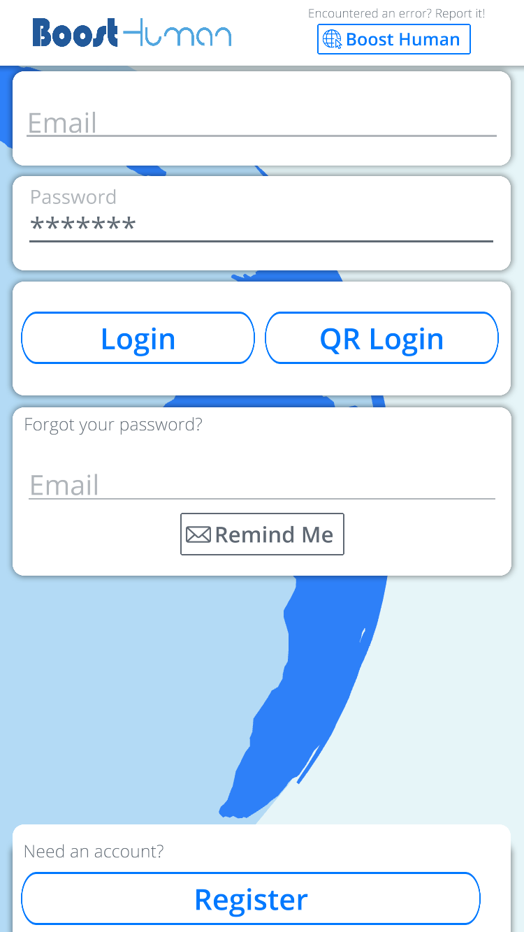
Login Screen - Old UI
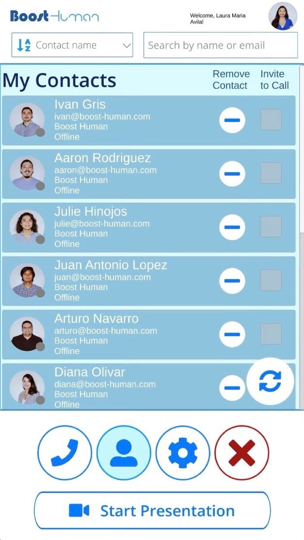
Contancts Screen - Old UI
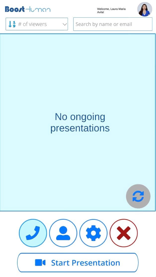
Presentations Screen - Old UI
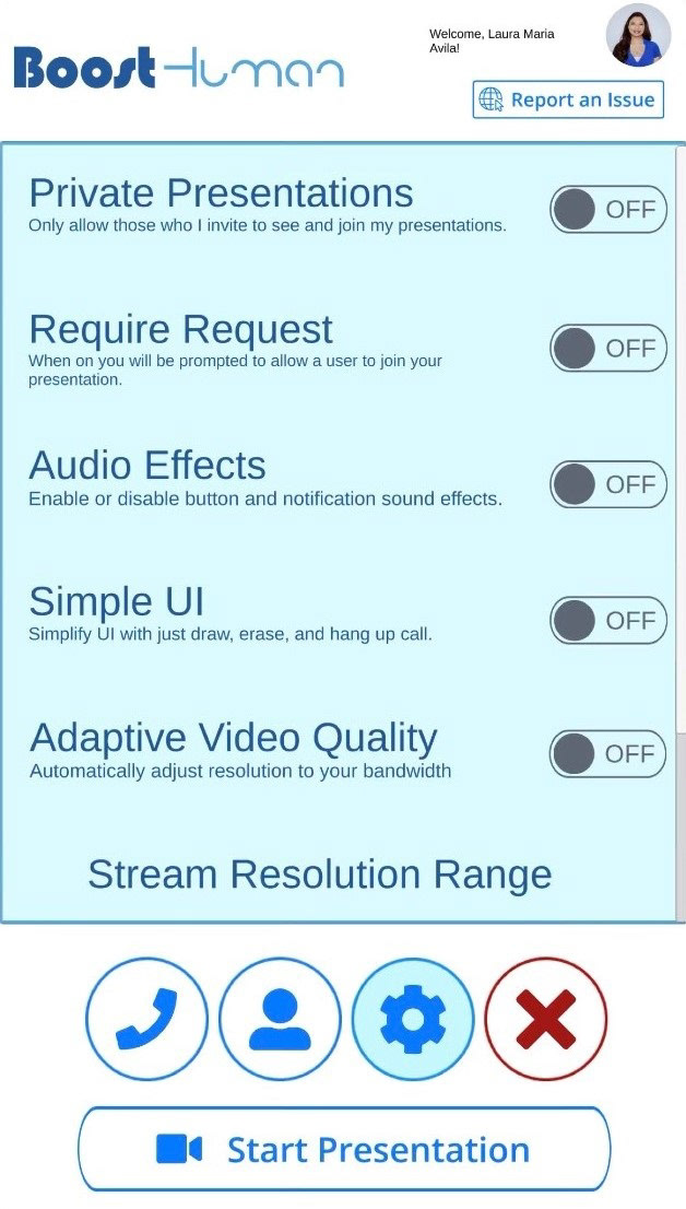
Settings - Old UI
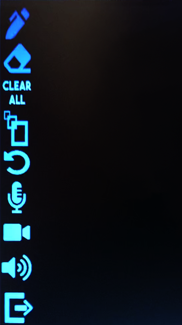
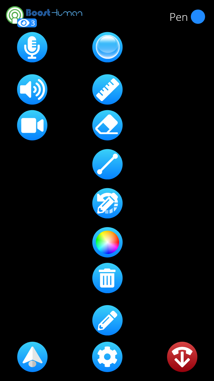
Presentation Screen - Old UI
After the Redesign:
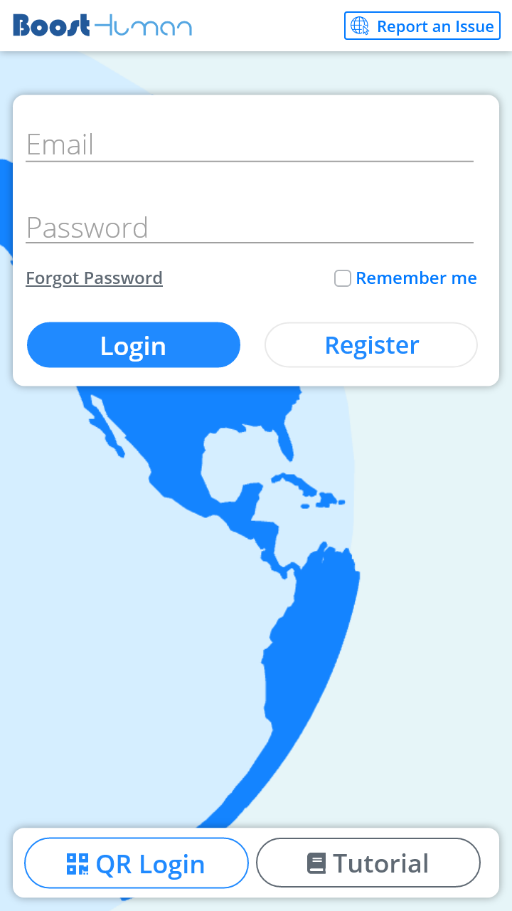
Login Screen - New Design
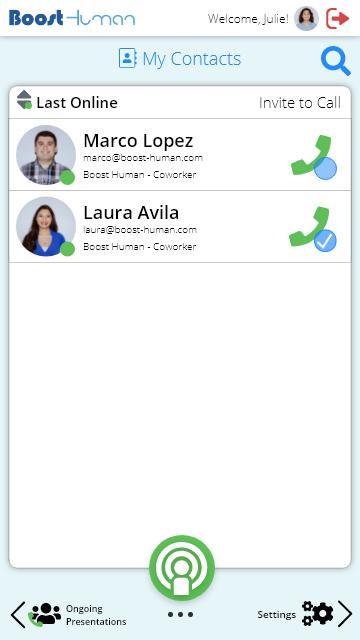
Contacts - New Design
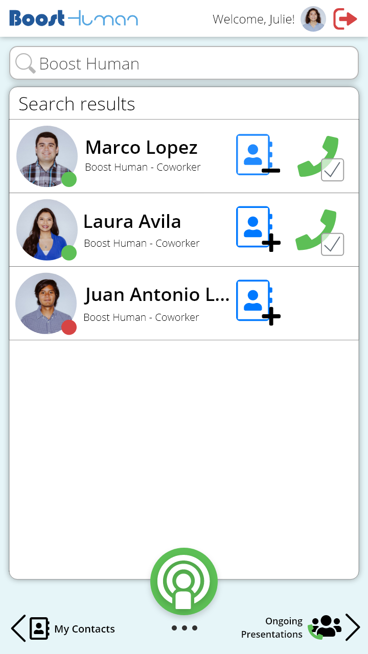
Searching for Contacts - New Design
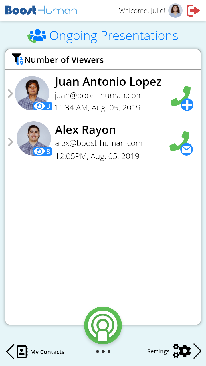
Ongoing Presentations
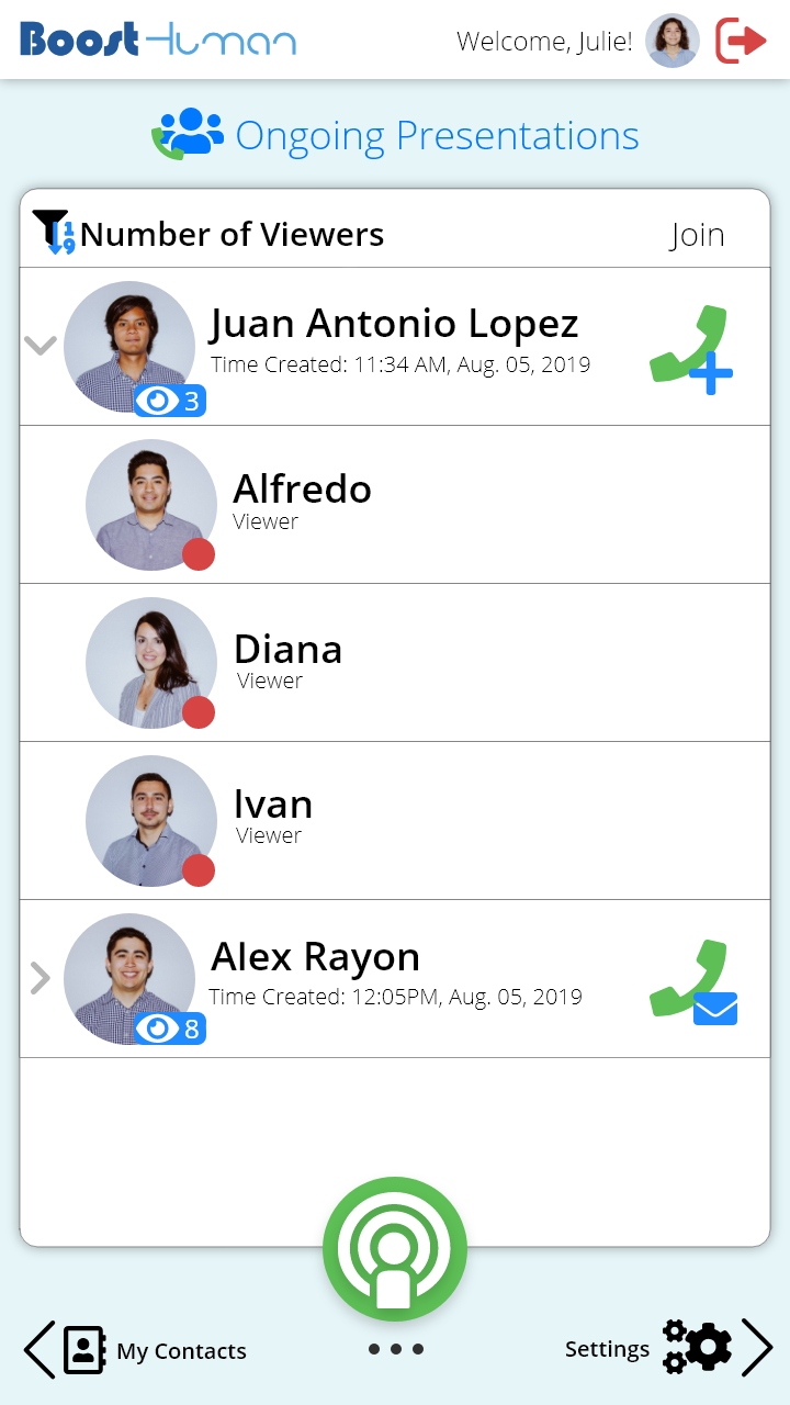
Ongoing Presentations Expanded View
Ongoing Presentations Refreshing
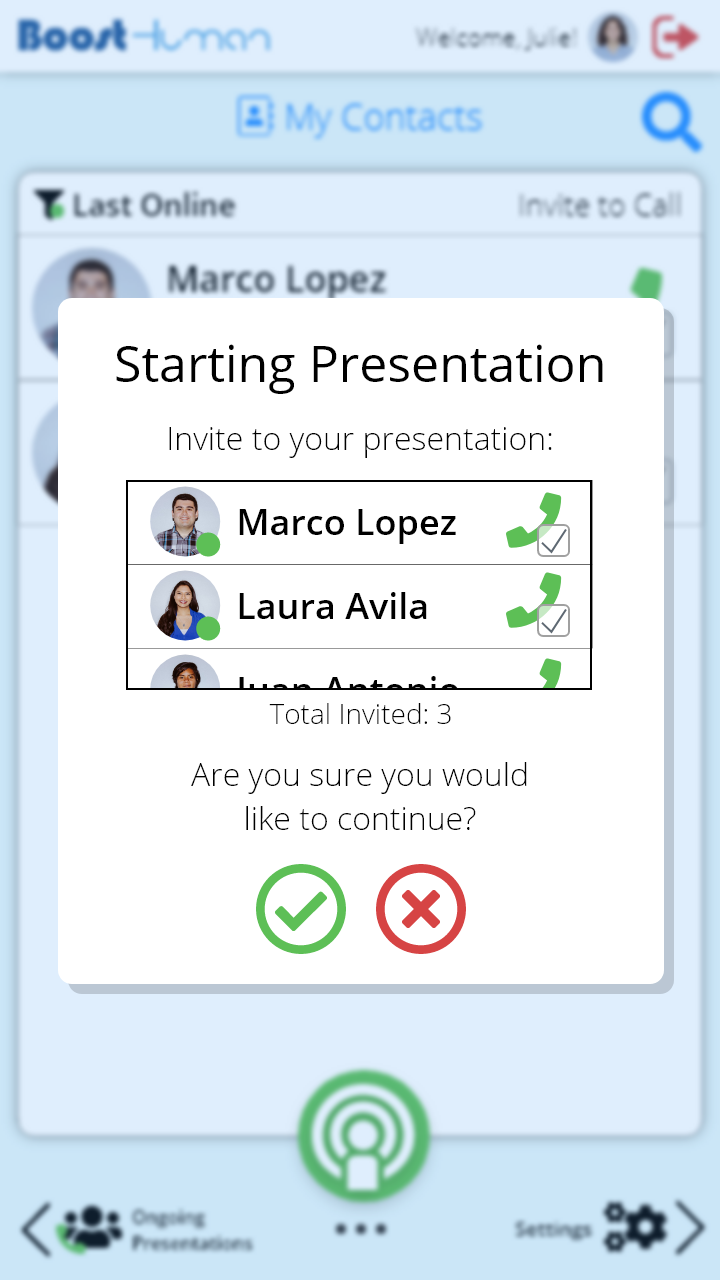
Confirm Starting a Presentation
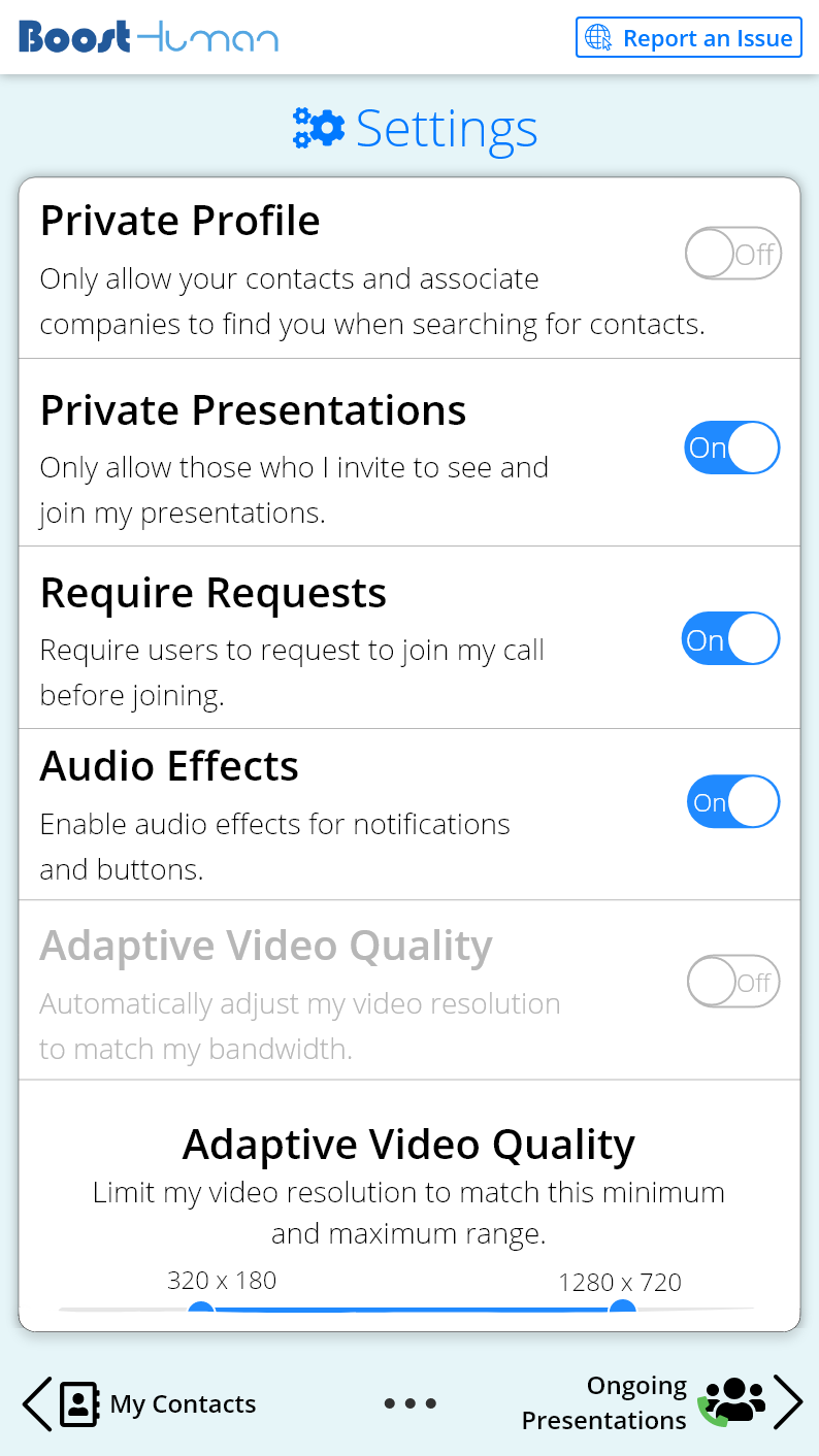
Settings